Industry
Nonprofit
Client
Rotary International
Rotary Grants Redesign
Project Overview
Summary
The Rotary grant application interface was confusing and lacked a visual hierarchy. Screens were heavy with instructional text that was used to mitigate unintuitive interactions. These issues, and more, created many friction points for users resulting in a frustrating experience. A key indication of this frustration was the high levels of staff interventions and support required for each application. Our team was tasked with redesigning the application with a focus on an intuitive low-friction experience – for both new and experienced users.
My Role
I owned the end-to-end UX design process and deliverables. I facilitated design workshops, card sorting, user flow mapping, user research, and other activities. As an Agile team, I was also part of the story grooming, estimating, and defining acceptance criteria sessions. I followed the double diamond process with a lean UX approach. I also would regularly meet with business stakeholders and subject matter experts to share findings and review changes.
Key deliverables: UX research, competitive analysis, use case scenarios, user flows, story mapping, IA, UI design, design patterns, wireframes, high/low fidelity mockups, prototypes for testing, and CSS when needed.
Legacy Grant Application
The first section did little to orient or onboard users.
Long scrolling was the only way to know what a section contained.
Design Process
My process usually moves through a four step process based on the double diamond design process. This assures the outcome is as consistent as possible.
Research to collect data on the problem
Analysis of the data to understand the problem
Ideate solutions informed by analysis of the problem
Testing design solution effectively solve the problem
Research
Technical Audit
Rotary grant application is built on the Smart Simple platform. However, the version used for the grant application is highly customized. Unfortunately, these customizations locked Rotary into an older version of platform. This older version had no API, which would have allowed us to build the UI separate from the platform and circumvent functional limitations. Updating the platform version was out of scope due to the requirement of having to build both user facing frontend and customize the backend staff admin interfaces. However, our technology partners, Re-Solved were able to invent workarounds that allowed us accomplish the redesign as planned. Here is a case study from Re-Solved.
The Domain
I did a deep dive into all aspects of grantmaking including others in the service and governmental domains. I also joined a Slack group specifically for professional grant writers. Joining that group allowed me to leverage their expertise, best practices, industry pain points, and research. This was very helpful when it came time to work on the active grant reporting workflows.
The Problem
Once gaining an understanding of the grantmaking process, I conducting a heuristic evaluation of the legacy grant application. I found it failed on most all of the 10 usability heuristics used. Some notables were the lack of consistency and standards in providing a visual hierarchy of UI elements like buttons, labels, and visual design. User were forced to add information to each tab before advancing. This forced users to enter "dummy" data if they wanted to move to a tab they had actual data to enter. There was also no contextual errors, incorrect data input was only flagged as an error once the section was saved. Transparency into the completeness of an application was also missing. Users would have to go through each section and review each field to make sure it was completed to the system’s expectations.
Also, some of the questions collected responses in text fields which required staff to read and validate each of this type of answer. This led to users being asked to revise answers given to better match what staff required.
A Baseline
I conducted usability tests with the legacy system in order to capture baseline metrics for time on task, error rate, and overall user satisfaction.
The Users
User interviews identified three primary user groups with specifics roles and access levels. Although users had specific roles, they also had characteristics that impacted how they used the system. This was the level of familiarity with grantmaking and Rotary’s grant application. This would help to inform our content strategy and design patterns.
Grant writer user who are use the full grant application from start to finish. These are the primary users of the product. Behavior of these users were linked to their level of experience with grantmaking and the application. Novice users tend to be easily confused with jargon and accessed in-app support resources as a reference. These users were more likely to leverage the help resources and documents before reaching out to staff. Experienced users have prior grantmaking experience and/or in a dedicated grant writer role at their club. These are power users of the system and will find workarounds system issues before reaching out to staff.
Oversight users use the system to provide oversight and give their sign-off approval. These users might be reviewing five to ten grants at a time. Their focus is each grant’s status, needed actions, and any associated issues. These users do not have permission to edit the grant application they are sign-off on.
Participant users are part of the grant as a recipient of a scholarship or as part of a vocational training (receiving or providing). These do not have permissions to directly author or edit a grant application. However, they do have specific workflows for planning and reporting.
Analysis
Themes
One theme that emerged from research findings was how slow users progressed through the application and the high rate of user errors. Through usability testing, it was clear that a lack of visual hierarchy with buttons, inconsistent placement patterns, and large amount of instructional text were factors. These issues reduced the overall usability as users were forced to carefully consider each action. When users did try to move quickly, they made errors, usually clicking on an incorrect button due to the lack of a visual hierarchy. Buttons had no indication of what was a primary, secondary, or tertiary action for a given interaction. This was even more problematic when some actions were destructive, such as deleting an entry.
Pain Points
The research also highlighted many pain points such as what was referred to as the “wall of red”. The final step of before submitting the grant to Rotary, it has to be flagged for authorization by the oversight members. The system would then run a global validation and display any errors found. While this makes sense from the perspective of authorizations should be made only on valid grant applications. The problem is that the errors are not displayed contextually in each step. This caused users to become frustrated and question why they were allowed to move forward in the application when there were so many errors.
Ideate
Mapping Flows
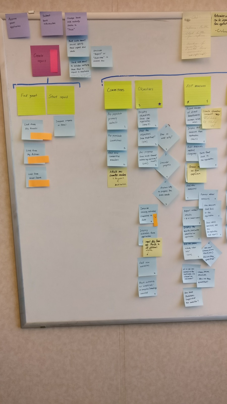
Because of the large size and complexity of the grant application, we created a user story map for each user role. User story mapping aims to captures the end-to-end user flow and all the tasks completed as part of the flow. The tasks cans be converted to user stories, grouped in to epics, and identify an MVP.
Structure and Interface
Based on what we learned from the user story mapping, I created wireframes, layout patterns, and information architectures. I validated them with the team and stakeholders. From there I created low and high-fidelity mockups and then prototypes for usability testing and validation.
Remove Pain Points
Discoverability of content and lack of visibility into the completeness of an application were key pain points. The legacy application was structured into seven tabs labeled in opaque organizational terms that did not help users understand the content within. For example, the tab labeled “Participants” had sections for those involved in writing the grant, participants, partners, sustainability, and more. Some of this content is related and some is not. To make the application intuitive and easy to navigate, we restructured it into thirteen steps. These steps were labeled to be transparent as to the content within. We also created a new section called “Application Finalization & Submission”, which provided a clear break between authoring the grant and submitting it.
Visibility into the completeness of an application was addressed by adding completeness indicators for each step. This provided a low effort, and intuitive, way for users to quickly scan the application and understand their progress.
We also addressed the “wall of red” issue by adding contextual alerts, errors, and conflict logic in each step.
Testing
Validating Solutions to Problems
I created clickable prototype flows, using the Usertesting.com platform, and proceeded to test with users.
We took a lean UX approach to getting user feedback and applying insights quickly into design iterations. This was made possible by the access we had to engaged and insightful users.
This provided the necessary validation to be confident on design solution build candidates.
Outcome
The redesign received very positive feedback from users and staff. Some improvements delivered:
An intuitive visual design and design system with a clear visual hierarchy
Information architecture, navigation, and workflows that better reflected users’ expectations
Simplified copy written in to be understandable with less organizational jargon
New functionality allowing grant authors to disable the auto submit function
New dashboard with aggregate views of all grants and their status
New dashboard with aggregate views for managing authorizations
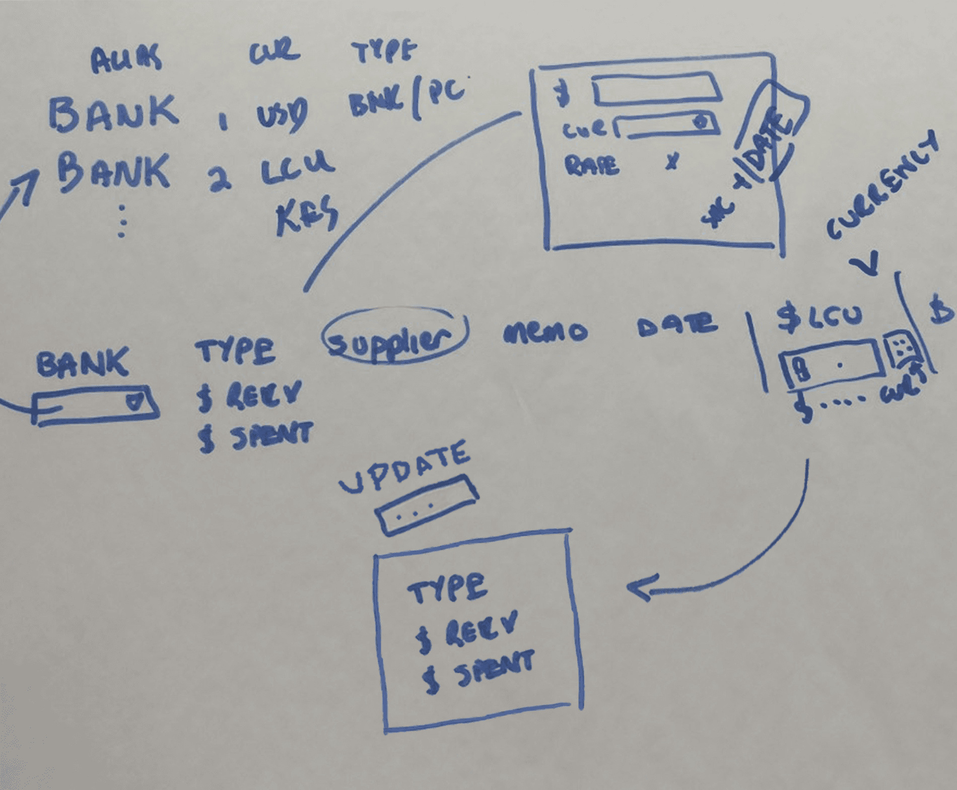
New reporting functionality including allowing the input of expenses in the currency they were made be converted back to the grant currency
New participant and training team sections for managing and reporting
A reduction of staff interventions of more than 25%
Improved user satisfaction by 92% (based on user feedback and surveys)
Redesigned Grant Application
Step 1: Grant Information
Application Finalization & Submission
Reporting Project Expenses
What did I learn?
Collaboration is key. Working closely with staff allowed us connect with users who provided essential insights.
The more you know. Spending the time learning about the grantmaking domain was time well spent. I would have not known what a logframe is and how I used it to inform the new structure.
Sprint ahead to keep up. Our team worked in two-week timeboxes. To keep up with development, our design sprints were two weeks ahead. This worked out well as it allowed us to work from the backlog and focus on completing epics.


